“Color that perfects the skin.” That got my attention. I am always looking for natural beauty practices and products.
The idea that all humans fall into one of 12 color palettes or “tones” fascinated me for other reasons than instant rejuvenation. Coloring is a key piece of Mien Xiang (diagnostic facial diagnosis), which is a critical part of my practice. I also have a love of systems. This drew me to Sci-Art Color Analysis and the pages of Christine Scaman’s blog. She practices in Canada but she referred me to her teacher, Terry Wildfong, in nearby San Jacinto, CA.
A Little Background
The 12 tones are based on the Munsell color system (book available here). It is a research-based system that describes how the human eye responds to color. Our eyes process colors in terms of chroma (soft/bright), temperature (cool/warm), and value (dark/light). There are 12 color families created by variations of these color properties as shown in the diagram below:
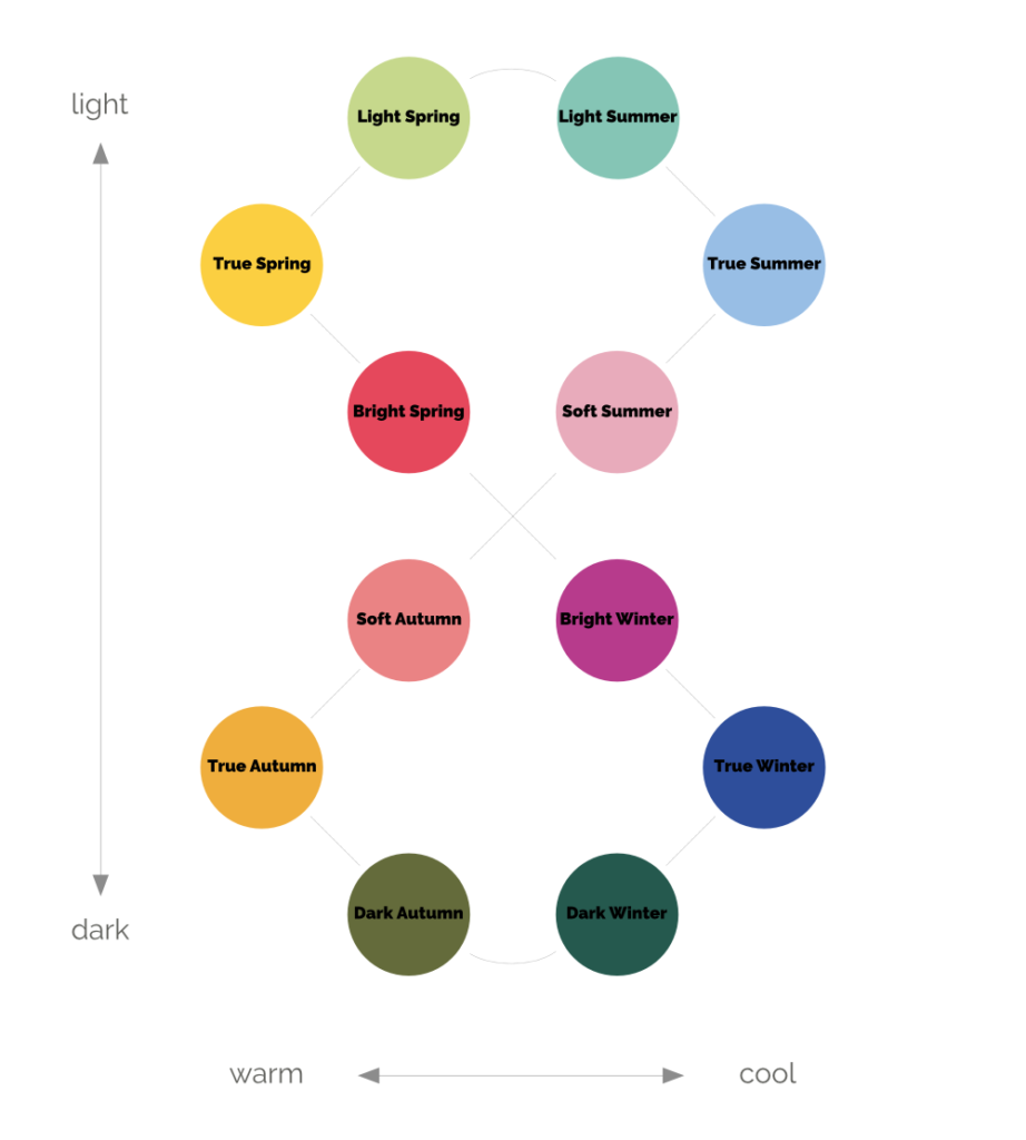
Image from elementalcolour.com.au.
When I made the appointment, I was a self-diagnosed True Winter. This was largely prejudiced by my snow white combination of dark hair, pale skin, and blue eyes.
I walked in ready for anything. The analysis room looks like a mini studio with bright lighting, a neutral background, and a large mirror. There was a stand holding endless beautifully colored drapes in every hue and texture. Terry explained color theory to me and how we see colors in relation to one another. The purpose of color analysis is to find harmony between ourselves and the colors we wear.
The Terry began using different drapes to find negative and positive reactions. The drapes are truly magical. Our eyes have trouble seeing how a single color affects us, but when we compare 2 colors, the difference becomes distinct. The facial features actually appear to morph, the skin changes color, we change age, and even our personality appears to shift. In this way, through multiple comparisons of chroma (soft/bright), temperature (cool/warm), and value (dark/light) we arrive at the exact recipe of the undertones of our skin. This not about the hair color, eye color, or the overtones of the skin.
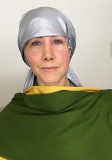
Autumn colors combined with the gray headscarf made me look like a long suffering peasant from the set of Anna Karinina.
We quickly ruled out warm and muted (i.e. Autumn). The brightness of Spring (warm and bright) uplifted my features mitigating the fact that the warmth of the colors turned my skin yellow. I was clearly a cool, either a Winter or a Summer. This is where it got tricky, so much so that I came back for a redraping.
Two weeks later I returned. Terry was on a mission. She covered not only my hair, but also my brows, in the lovely gray head covering you see pictured. There would be no distractions. We revisited the 4 finalists, all cool or cool neutral.
The purpose of the test drapes is to cause a reaction in the skin. These will most likely not be your best colors, but they will cause strong, noticeable reactions. In the pictures below you cannot see the dramatic shifts in energy that you see in the studio, but it gives an idea of the process.
True Winter is tested against True Summer. We had gotten stuck between the two during the first draping. I felt like I was in between the two. On Day 2, Winter was the winner.
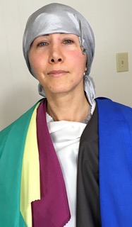
True Summer (cool/muted) – The boldest blue greens, fuchsias, and blue violets of the palette were really good, but the neutrals turned my features to mush. My skin became more blotchy. I wasn’t sure if I looked soft and feminine or feeble and near death.
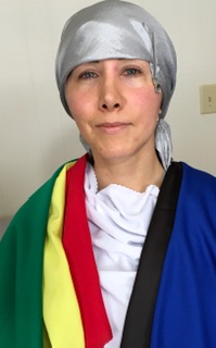
True Winter (cool/saturated) – These colors were starker and colder in person than I had imagined them to be. I couldn’t tell if I looked powerful or harsh. Some of the colors thinned my face, but not in a flattering way. The colors did clear my complexion.
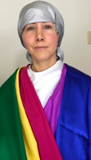
Bright Winter (cool/neutral/bright) – One look at the makeup colors online (shocking pinks and maraschino reds) and I ruled it out, but seeing the drapes in person was a different experience. By far the most flattering neutrals on my skin. I felt the balance of intensity and softness that neither True Winter nor True Summer fulfilled. My skin lifted and became more uniform.
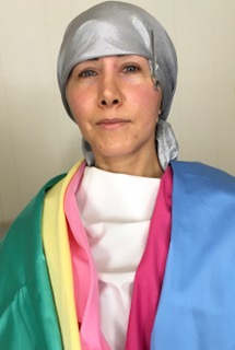
Light Summer (cool/neutral/light) – Bright Winter is tested against Light Summer as they have much in common. My eyes loved the pinks and aquas, but the rest of my face disappeared. Clearly a “no”.
Really, Bright Winter?
I wasn’t ready to allow the Bright Winter lipstick near me. Terry, who at this point in her career is part psychologist, didn’t even try. She knew I was a low to no makeup kind of girl. Instead, she showed me how some of the Light Summer and True Summer cosmetics provided a more gentle effect while still staying in the cool/neutral playground. (Terry carries both Mary Kay and the 12 Blueprints line of makeup in her studio).
Emmy award winning makeup artist (and dear friend) Dale Bach, taught me how to adapt makeup to my features and personality. For me, that means using small, strategic placement of color. I am also inspired by the Korean makeup styles (many of which suite Bright Winter coloring). I can express my Fire in colorful clothes and eccentric accessories, but in makeup I am pure Metal element. I want minimalism and purity that doesn’t distract from me.
Because Bright Winter is cool/neutral, there is a cool to slightly warm spectrum to the palette than can be explored in makeup as I detail below. I found the 12 Blueprints True Summer eyeshadow palette too dusky and muted, but Light Summer worked.
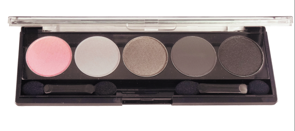
Light Summer eyeshadow palette from 12 Blueprints – The three taupes on the right work very well on me with an icy lavender highlight like Frees Ya! from Elea Blake. Another option: the champagne highlight from the 12 Blueprints Bright Winter palette gave a beautiful glow. The two highlights on the left of the above picture didn’t work on my skin.
Blush and Lipstick – Warm side of the palette
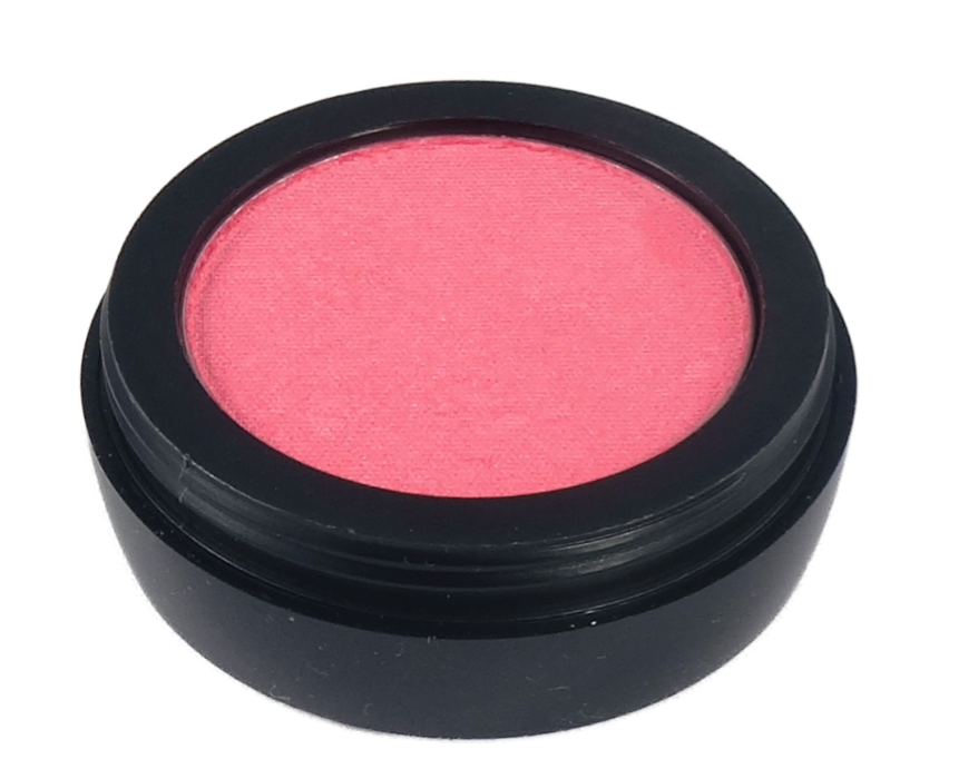
Orchidee Light Summer – 12 Blueprints cosmetics are highly saturated. What I like about this blush is that I can apply as heavily as I want and on my coloring it still looks like a natural glow. It is the strongest of the Light Summer blushes.
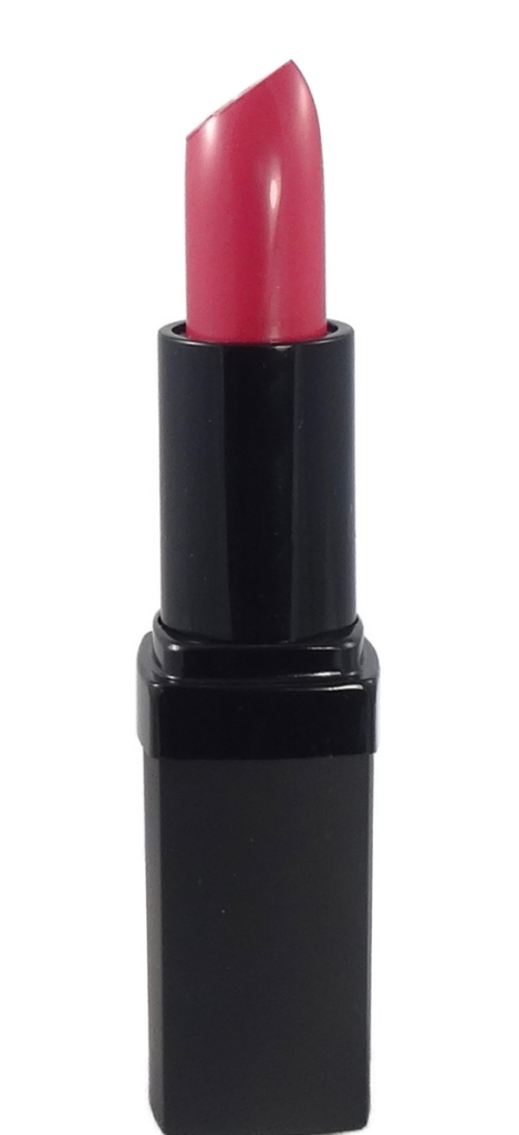
Flowergirl Light Summer – This glossy pink lipstick is very delicate but is great for daytime when I want to look polished but not made up.

Bijou True Winter – I had purchased this gloss when I thought I was a True Winter. It is like a MLBB shade and goes well with both cool and cool/neutral colors.
Blush and Lipstick – Cool side of the palette
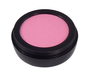
Watered Silk True Summer – This is my favorite blush! Perfect for a natural glow.
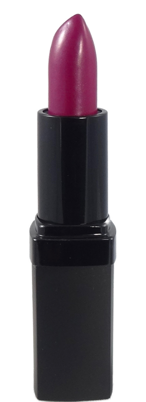
Supreme True Summer – This is where Terry talked me into a real lipstick, though still subtle, it was colorful enough to make my eyes pop.

Now or Never True Winter – This is another gloss I picked up when I was moonlighting as a True Winter. It gives a subtle fuchsia pink effect.
from WordPress https://ift.tt/2F7bxs0
via IFTTT
from Tumblr https://ift.tt/2TFxEzY
via IFTTT